

It is well documented that the human eye perceives white containing a blue shade as being extra white. As a result, for many years manufacturers have added pigments and OBAs (optical brightening agents) to the coatings of their paperboards to reinforce the blue shade. Papers with a lower level of blue will therefore appear yellowish when placed beside a blue-shaded product.
This property of the human eye has created some challenges for Holmen sales reps when they have met with graphic designers and packaging designers who want to print on “the very whitest board” and who therefore compare different products by placing them side by side.
Neal Haussel, Director of Strategic Business Development & Sustainability North America at Holmen, has experienced this situation personally. He finally decided to do something about it.
“I can affect how you perceive a colour depending on how I present it.”
— Neal Haussel
“I got tired of repeatedly explaining that the so-called whitest products were actually blue – and of still getting sceptical looks. ‘There must be a better way of explaining this,’ I thought, and so I decided to create a ‘whiteness tool’.”
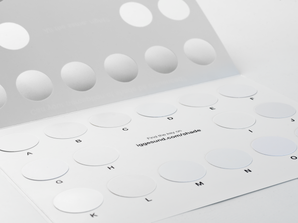
The first version of the tool was launched as part of a marketing campaign ten years ago. The third version now being used is simple and elegant – just a folder that can be opened out. Its contents amaze most people, as Haussel explains:
“The tool clearly demonstrates that I can affect how you perceive a colour depending on how I present it and in which context. When the folder is opened, it shows circles of various products against a black background, and they all look equally white. When the black background is taken away and replaced with a white one, the differences become obvious. Some of the circles look blue, others grey, depending on how much OBA or pigment has been used. It’s also clear from the folder that Holmen's product is simply white. The key with all the technical information is available here.
If OBAs are added in excessive amounts, they can influence a product’s lightfastness, that is, its colour stability, Haussel continues:
“An OBA works by taking a wavelength just outside the visible spectrum for the human eye and converting it to a wavelength just inside it. What happens, though, is that an OBA will gradually stop performing this conversion. The result is that the colour shade of the product changes. Holmen's product has extremely good lightfastness. That’s important for a brand that uses a lot of white in its packaging.”