

If you look closely at the data, you will notice that the grades with the highest measured CIE whiteness also have the largest negative b value, and conversely, the grades with the lowest measured CIE whiteness have the smallest negative b value (are closer to 0).
But are they really white? Well, no, not really. The CIE measure of whiteness is a measurement of D65 light reflected by paper. D65 illumination is commonly accepted to be daylight, or the full spectrum of visible light. Do you remember ROYGBIV? R-Red, O-Orange, Y-Yellow, G-Green, B-Blue, I-Indigo and V-Violet. There is a specific wavelength associated with each of the colors represented in the spectrum of visible light. A perfect white sample will reflect the all light to which it is subjected and hence have 100% in whiteness.
So, how do papers (i.e. most of the grades in the chart above) reflect measurements as far above 100% as 145% and higher? The answer lies in how the CIE Whiteness value was formulated. A panel was presented with a wide variety of samples of varying tints, and asked to judge their whiteness. From there an equation was developed to account for the fact that samples with high levels of blue dye or fluorescent agents were perceived to be of higher whiteness. The blue dyes simply make paper bluer and they are therefore measured as having a higher CIE Whiteness value, and the fluorescent brightening agents absorb invisible ultra-violet light and emit blue light, producing the same effect. So, papers can have higher than 100% in whiteness by exploiting the CIE Whiteness calculation using either blue dyes or fluorescent brightening agents (OBA’s) or a mix of both.
In the “eyes” of the spectrometer, a sheet of beater-dyed blue paper could be measured as having infinite whiteness.
So now blue is white. Huh? What do your eyes see as white?
So, does any of this really matter when it comes to your preference for a shade of white? Nope. Not at all…you like what you like, and I like what I like. Shade is completely subjective.
This printed piece is not an attempt to convince you that one shade is better than another. It is intended to demonstrate that your perception of shade can be influenced based on how it’s presented.
Demonstrating that your perception of shade can be influenced is intended to shift the discussion from one of preference, which is subjective in nature, to the objective discussion around what you should consider when choosing a paperboard for packaging.
So, what should you consider when it comes to shade?
Packaging design: Shade and printing over it
Let’s think about the accuracy of color reproduction for 4C process print. First, consider what the L.a.b. values in the chart represent and measure.
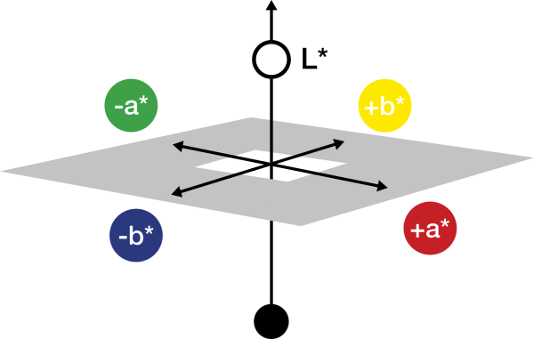
The a* and b* values describe the shade of the paper. a* corresponds to the red/green scale and b* corresponds to the blue/yellow scale. The higher the a* value, the redder the paper. The higher the b* value, the yellower the paper. Conversely, the higher the negative b* value, the bluer the paper. The key is often to find a balance between green/red and blue/yellow, in order to produce a paper that is felt to be easy on the eye, while also looking white. The L* value defines the brightness of the paper.
Remember, specific wavelengths are associated with each of the colors in the visible spectrum, and that light is reflected from the surface of the paper to your eye. If a paper has a blue-white shade which is created using blue dye in the pulp, it is absorbing more of the red and green wavelengths. The sheet is essentially pre-printed blue, making it difficult to accurately reproduce printed yellow. Papers which achieve their blue-white shade, or high whiteness, using OBA’s are less affected in their ability to accurately reproduce color since printing inks limit the amount of ultra-violet light to which the OBA’s are exposed.
Invercote reproduces the broadest range of color with the greatest degree of accuracy!
Now let’s consider the importance of reproducing PMS colors for brands. How important is that robin egg PMS blue to Tiffany, or that very specific PMS red to Coca-Cola? Reproducing PMS colors accurately is critically important to brand identity. In this case, what is vitally important for a paper manufacturer is the ability to produce a consistent shade from manufacturing run to manufacturing run, because printing ink is semi-transparent and, as such, if the shade of the paper underneath it varies, so too will the printed PMS color being printed over it.
Papers that have exceptionally high levels of OBA or use a lot of fluorescent dye in the their fiber furnish are difficult to manufacture to a specified shade from manufacturing run to manufacturing run.
Consistency is the hallmark of Invercote quality!
Packaging design: Shade as white space
White space is very often used today in packaging design. So, what’s important about shade and whiteness when using it as white space in packaging design? Once again, consistency! If the white space used in your packaging design is an essential element to your brands identity, then using a paperboard that can be manufactured to a consistent shade from manufacturing run to manufacturing run means that the package produced today will look the same as the one produced 3 months ago; or that the package produced in Europe or Asia will look the same as the ones produced in the United States.
Consistency is the hallmark of Invercote quality!
Another extremely important consideration when white space is incorporated into packaging design, is what’s known in the paper industry as lightfastness - often referred to as fade resistance. Since most manufacturers of high quality paperboard use OBAs, it is important to understand how they work and how they react when exposed to light over time. OBAs are like anything else; there are OBAs of higher quality and OBAs of lesser quality. But better fade resistance is more than just a function of OBA quality. While OBAs create a “whiter” appearance, when exposed to light over time, they lose their ability to reflect the wavelengths from outside the visible spectrum into the visible spectrum-the result is shade reversion.
Better lightfastness is a function of maintaining the performance of OBA, and since the performance of OBA is degraded when exposed to light over time, producers must consider ways of protecting them from exposure.
A package produced 3 months ago sitting on a shelf next to the same package produced yesterday often appears to have a very different shade. Invercote’s proprietary coating formulation and OBA application methodology is the basis for its superior lightfastness. It essentially hides the OBA from exposure to light.
Invercote has, far and away, the best lightfastness characteristics in the business!
Lastly, how important is it for your package to look the same under different light sources? In other words, if your packaging will be sold in different retail outlets where you don’t have control over the lighting, or “unboxed” in a setting where the lighting can vary dramatically, how consistent is the shade of the paperboard under those varying lighting conditions? Using too much OBA or fluorescent dye can cause the appearance of shade to change significantly under different light sources.
Invercote maintains a very consistent appearance when light sources vary!