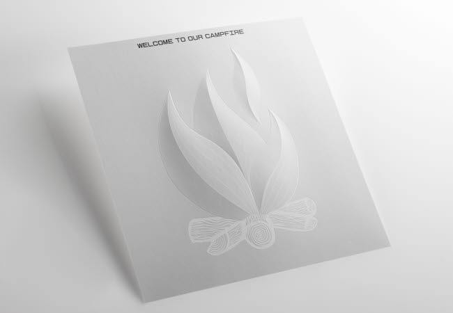
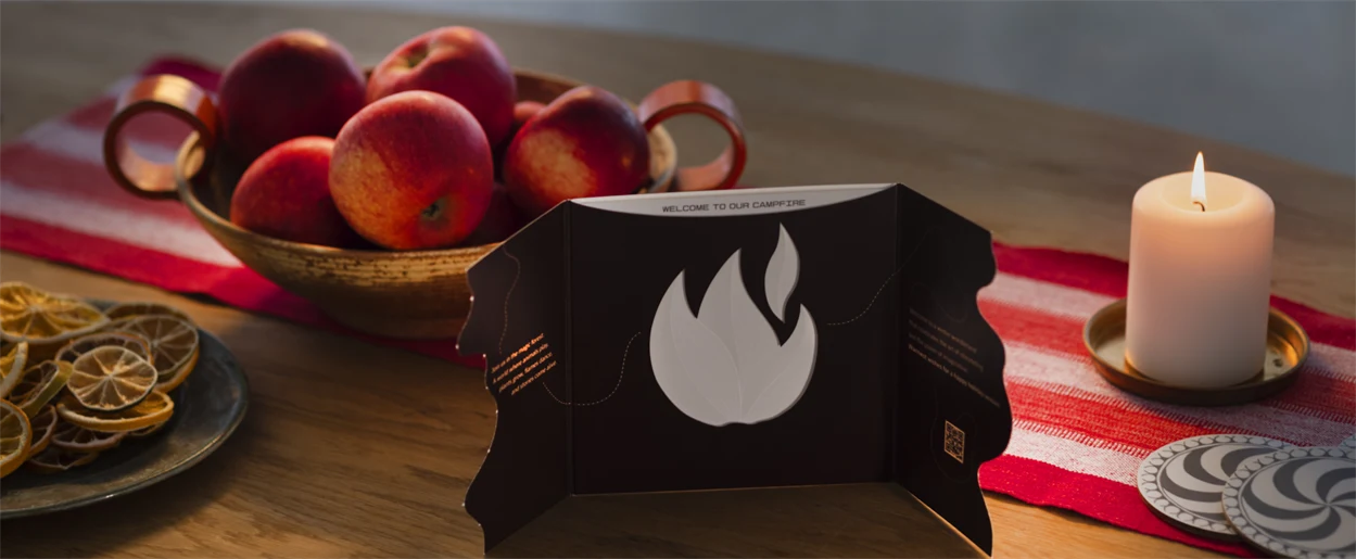
Holmen is celebrating the art of storytelling and the power of collective imagination with its new season’s greetings card. The front of the card has a path, which recipients tear apart to reveal a magical wintry forest inside. The path continues to a campfire, printed on an insert, representing the idea of pausing, sitting down together and sharing stories to explore what kind of stories can be created next.
The card was brought to fruition through a collaboration between Holmen, Swedish designer Kristina de Verdier, and French graphic design studio Créanog.
“Our new season’s greetings card symbolises the magic that emerges when we work closely together. That experience can lead us to discover new opportunities and solutions. Collaboration is at the heart of Holmen. We are curious about you and your business, and want to bring in our knowledge and expertise,” says Johan Nellbeck, CEO of Holmen.
“As 2023 comes to a close, we want to thank all our customers and partners for their loyalty and support with a special season’s greetings card,” Nellbeck continues. “It is natural during this season to reflect on the year gone by. But we also want to look ahead with our customers and partners towards the future.”
Crafted from Holmen's Invercote G paperboard, the founder of innovation and design consultancy KDV Studio, Kristina de Verdier, conceived the card’s creative concept.

“We created the concept around the feeling of walking through a snow-covered forest and gathering with those close to us around a cosy campfire,” says Verdier. “The card invites you to discover, with each layer revealing a new design detail. With a clear focus on sustainability, we crafted the card with a minimalist design approach. We explored the elegance of subtle effects that highlight the natural qualities of the materials.”
Créanog has a long history of designing and printing luxury communications material for clients in various sectors, including jewellery, fashion, beauty and champagne. The production of the season’s greetings card is a testament to Créanog’s attention to detail. They applied the different complex printing techniques they have renowned expertise in, such as embossing and hot stamping, to the card to convey the feeling of a magical winter.
Another detail of the card, highlighting Invercote’s superior design opportunities, is that it was printed on a single sheet. This shows how the reverse side of the paperboard produces a high-quality print result, as the flaps on either side of the middle section are the uncoated side folded over. The colours are almost identical in all sections.


